Showing posts with label concept design. Show all posts

Wednesday, June 12, 2013

Monstrous Manual 005: Arcane WIP

This week I thought I'd show a bit of the mid-process artwork for the Monstrous Manual Project. The next monster I'm working on is called an Arcane, which are slender blue giants that roam around selling magical items.


I've started by creating a silhouette of the creature, gradually pushing and pulling at the edges until the shape looks right, flipping it horizontally from time to time to make sure it looks good both ways. I then start to block in different elements of the creature into separate layers: it's body, robes, bag, and cloak. This allows me to begin organizing the tonal structure while continuously making adjustments to the major shapes. I also usually put some extra time into the head, as I've found that allowing the focal points to be a bit more developed than the surrounding areas tends to help keep my creative momentum.


Once everything's blocked in and I like how the shapes are looking, I lock the transparent pixels on each layer so I don't 'color outside the lines' and start modeling the form. I usually try to travel around the piece evenly, working on adding details and pulling things into focus here and there. If I find myself focusing too much on one area, it's time to move on to the least developed area, or any other element that is calling for attention.

This technique has its drawbacks, but it is a quick way to play with ideas and start to get a sense of whatever it is you're creating. As for this artwork, I'll probably try to approach this monster from a different angle, but experimenting with this idea establishes a landmark from which I can determine a direction to move towards with the final artwork.

Tuesday, June 4, 2013

Monstrous Manual 004: Ankheg


This monster is like a big, nasty cousin of the things from Tremors.

Monday, May 27, 2013

Monstrous Manual 003: Aboleth


I haven't done one of these in a while. This creature's an odd one. It's got psycho-mind manipulation powers that turn adventurers into pwn-drones.

Sunday, July 17, 2011

Not Losing

Last night I went to Red Engine's anniversary party and was awarded a scholarship for a free class! I entered the contest with this little guy:


I also checked out Andrew Hem's show at LeBasse in Culver City, which I highly recommend for anyone in the area to go see and be amazed.

Friday, July 1, 2011

And Now, Here's Some More Stuff

First off, here's a book cover I worked on for a non-existent author. He was pretty quiet, but I could tell that he really liked the illustration I came up with for his non-existent story:


Here's an oil painting I did for a show with The Upper 600s, a great creative collective that puts together some awesome art shows. Unfortunately this piece didn't sell, so if anyone is interested, shoot me an email:


And finally, here's some character design stuff from my Red Engine class:


Monday, May 30, 2011

Sukechi Sketch

Here are some character development sketches I've been working on for the Red Engine class:


And here are a couple of the environment thumbnail sketches from last week taken to the next stage of development:

And finally, here's a portrait study I did today. I gave myself one hour to finish:

Monday, May 23, 2011

Concept Sketches

Here's some more stuff I'm working on for the entertainment portfolio class I'm taking:


Saturday, May 14, 2011

All Aboard!

Today I had my second week in a course I'm taking at Red Engine. The class is geared around creating a portfolio worth presenting to entertainment concept design studios. This is my first week's homework, creating ideation sketches for some monsters and and their slayers. I definitely recommend taking a class at Red Engine. The instructors can give each student an ample amount of time each week, they give awesome, direct, brutal (if need be) feedback, and their talent oozes out of the sides of the building like a scene from Ghostbusters II.


Monday, April 4, 2011

Titanic Struggle

I've finished a couple of new pieces recently. The first is a slugfest between some kind of centipede based giant worm and a huge golem... or maybe just aliens fighting over a can of beans. I mostly wanted to add some action scenes to my portfolio and play around with designing creatures. The other is a landscape, which I think my portfolio needs. I started it without much planning behind the narrative, mostly thinking about the use of silhouette and creating a composition based on the extremes of dark and light.


Tuesday, March 29, 2011

March Madness

Although a lot of my time has been devoted to smaller illustrations for the web, I have had a break in that work recently, and was able to work on a couple of larger pieces.

First is a piece inspired by the old Atari game Joust. I used to play it when I was little, on my NES. I remember continually dying because of that damn pterodactyl.

If you're not familiar with the game, you can play an online version of it here.


The next piece isn't really based on anything, other than the idea of making a pretty girl look sinister and trying to use soft light.

Tuesday, December 28, 2010

Goat Men

I've been trying to add more process and concept art to my portfolio, so I've started a few sets of character silhouettes. The idea is to play with the form of the character in as many ways as possible in a short amount of time, so the ideas can be discussed with a team or art director.

I've chosen to play with the idea of a satyr, faun, goat-man. One version is mostly human, another more monstrous, there's the standard hybrid, and the little frumpy guys.


Wednesday, September 15, 2010

Step-by-Step

This is a quick character concept I made today featuring a futuristic-James Bond bad girl-amazon:

Friday, July 2, 2010

AFK

The last month and a half appears to have snuck by me in my recent bout of activity. As I mentioned in my last post, I picked up a job doing illustration work for a facebook game. I have also picked up a couple other jobs, one for a fair-trade raw food company, and another for a local cat toy factory.

Unfortunately, this has not left me with much time to put towards personal projects, like many of the pieces featured on this blog. Both long-term projects will have to be put on hold, but I can still sneak in an hour here and there to work on short term proj-- Blah blah blah, I'm busy, you get the point.

So here is my latest project, a shot at character concept art for an air pirate.

Monday, May 10, 2010

Process, Pt 2

Welcome to the second installment of my ongoing series about process; a step-by-step walkthrough for illustration.

Step Three: From Thumb to Rough

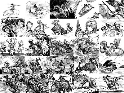
Now we have twenty-five compositions, but only one will survive. The first step in choosing the best thumbnail is easy: many of the thumbs will be boring, awkward, or just won't read. Pay attention to the overall shapes present in the composition, where dark shapes are on a light background, and vice versa. You should be able to identify the subject even at this stage.


The second step is to take the search for readability up a notch. Which compositions tell more about the subject than what it physically is? Which ones convey the subject's origins, emotions, and purpose? In this example, I'm looking for compositions that tell the viewer how the hippo rider operates as a powerful, amphibious soldier.


The third thing I look for is a bit harder to describe, and I believe it is something that comes with a lot of experience in looking, or being a visually oriented person. Sunlight shining through leaves and spiderwebs, the reflected light on the underside of a cloud at sunset, the rough textures of concrete under a streetlamp, a backlit figure on a hillside: some things grab the eye and hold onto it. Just like the sublime feeling that comes with listening to particularly good music while drunk, sometimes perception overrides the stream of consciousness, and allows us to just experience the outside world without the internal monologue. The greatest paintings have a certain charisma that draws attention to them and conveys drama. It could be the violence of the moment, the glory of the light, or the harmony of the tones and colors. Something stands out about these pieces, and it can start as far back as the thumbnail sketch. Certain thumbs will pop out at you, and you won't be able to explain why they are better than the others, other than that they are more evocative.

After narrowing down my choices, I am left with three thumbs, each with different elements that I like. Moving counter-clockwise from top left, I like the first for its drama and the how it seems to convey the power of the hippo, I like the second because the rider is clearly shown, while sending the eye back to the hippo with the line from the bow's arrow to the hippo's face, and the third conveys the purpose of the hippo riders as amphibious cavalry. The fourth, at top right, is a new thumb that I drew based on the other three, that will be the foundation for my rough sketch.


When handling a rough sketch I try to retain the loose sense of experimentation that I talked about in Pt 1 when handling thumbnail sketches. At this stage I have a general idea of the finished piece, but elements can be easily adjusted before they are defined. Now is not the time to add details, it is the time to define the major elements of the piece, to make sure that they work together to define each other.


Try to make sure that overlapping forms are clearly one in front of the other. Putting something in the foreground barely touching something behind it takes away the sense of depth. Also look out for lines that confuse the form rather than defining it. Sometimes lines from one object may look like the continuation of the lines from another, and both objects lose clarity. Hold the image up to a mirror, or if you're working digitally, flip it accordingly, to make sure that everything still looks good. Our brains do strange things, and the mirror quickly points out to us where a shape is wonky or a curve is weird.

In the next installment, I'll talk about arranging tones and moving into the final drawing.

Thursday, May 6, 2010

Process, Pt 1

How to Start a Painting

Welcome to the beginning of a series I am putting together to show my process of creating an image. Hopefully it will be informative and helpful for my fellows in the pursuit of artistic greatness.


Step One: Familiarization

Before you begin any project, you must do the research to know what you're dealing with. First, find out who will be looking at the piece; children, young men, and elderly women all expect to see something different, and have different tastes. Second, find out about your subject. If it is a living thing based in reality, learn about its behavior, its habitat, etc. If it is something unliving, learn about its history and the culture that surrounds it. If your subject is something that doesn't exist, find out about the closest things that do.

For this project, I will be illustrating for a personal project, a card game I am working on. It is similar to Magic: the Gathering, in genre and demographic.

The card I will be illustrating is called Hippo Rider, the concept being some kind of humanoid warrior creature(s) that use hippopotamuses as mounts.

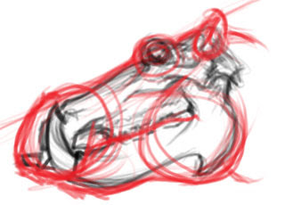
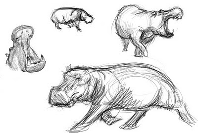
As I am already comfortable drawing the figure, my first step is to learn about the hippo. I go to wikipedia, watch nature documentaries, go to the zoo, whatever I can get my eyes and ears on so I can get a sense of the character of the hippo. By doing this I learn that they are massively powerful, fast sprinting, usually docile but potentially very dangerous and aggressive, communal, amphibious creatures. This is also the best opportunity to gather visual reference of hippos in various poses to use later.

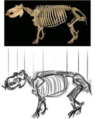
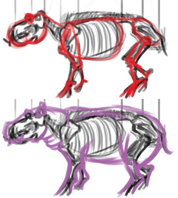
Now, finally, I can start drawing. I begin by learning the structure of the hippo by doing a couple quick skeletal overlay studies:


This gives me an understanding of how to arrange the hippo's anatomy, how it moves, and how its massive weight is held off the ground. It also gives me the opportunity to mentally catalog the unique visual characteristics of the hippo so I can draw it quicker and in such a way that it is easily identifiable in the image.

Then, I draw a few quick sketches from the visual reference I have collected, so my hand and eye get a feel for the kinds of curves and shapes that make up the creature. This also serves as a warm up for drawing the thumbnails. Warming up can be very helpful.


Step Two: Thumbnail Sketches

Next, I deal with composition. I work at the proportions of the finished piece, scaled down. I explore the various ways of displaying the hippo rider's form. At this stage, I don't have to put more than a few minutes into each thumb. Many artists put in less time, or do more thumbs, but I find twenty five gives me a lot of options, and allows each thumb to be clearer.


Try to think of each thumb as a visual experiment. Don't let any one thumb become too precious. Just put the idea down and move on. It can be easy to run out of ideas if you let yourself get too rigid. Only adhere to what is absolutely essential to the image, and let everything else change. In this case, so long as I show at least one hippo and someone sitting on it, it passes. Play with the angle that the subject is seen from, the situation the subject is in, etc.

In my next installment, I will talk about picking out the thumbs that work best, and moving into the rough sketch.

Friday, April 30, 2010

Fox in Socks

This week I handled a freelance job designing t-shirts. I worked with the phrase "crazy like a fox", and drew some fox stuff and illustrated type.

This piece is one of the rejects, taken to the next level. The way I handled the stylization of the figure made it unsuitable for the demographic the t-shirt company was going for. However, I thought it was a good character concept, at least. So, after finishing the job I put in a few hours to polish up the drawing, and here are the results:


P.S. A special prize goes to the first person who can spot all the vulpine references in the costume.

Wednesday, April 21, 2010

The Monstrous Manual Project 002

The next installment of this nostalgic project was a little harder to pick than the first. I decided that there was no way I could continue going in alphabetical order, or any organized order, for that matter. But that posed the problem of an over abundance of really inspiring options. In the end, I decided to pick creatures based on what would be good for my portfolio. So instead of painting nymphs, dryads, or other humanoid creatures, I chose:

Wyvern

Pronounced why-vern, this two legged cousin of the dragon is a terrible airborne predator. They swoop down on their prey, attempting to sink their talons into it and lift it up into the air, where they bite and use a deadly, poisonous stinger on the end of their tails. Around forty feet from nose to tail, propelled by a fifty foot wingspan, these things can fly carrying two man sized creatures at once, and could even prey on larger fare.


Sunday, March 14, 2010

The Monstrous Manual Project 001

I recently dug out my old Advanced Dungeons & Dragons 2nd Edition Monstrous Manual. Flipping through it reminded me of how much I used to sit with it in front of me, just looking at the illustrations. It's part of the reason I got into art. Anyway, it occurred to me that with all the great creature descriptions inside, I should try making my own illustrations. If nothing else, it'll be good practice and more stuff for the portfolio.

DISCLAIMER:

Dear Wizards of the Coast,

Please don't sue me.

Thanks,
~Z~


Aarakocra

The first creature in the Monstrous Manual, as it is alphabetized by the creature names, is the Aarakocra. Aarakocra are bird men that live in tribes in the mountains. They share large communal nests, and hunt with javelins using their thumbs on both hands and feet.


Sunday, January 24, 2010

Shadows

Here's a creature concept I'm submitting to a contest on ArtOrder, a blog run by D&D's art director, Jon Schindehette. It's a great read for anyone interested in fantasy art. Jon presents a new challenge every few weeks, and gives an enlightening look into the mind of an art director on a regular basis. The contests are usually based on past projects or something similar, so it's a great way to work up a good portfolio.

Anyway, this time around the contest was to reimagine a creature from one of D&D's many Monster Manuals: the Devil Assassin. This monster can manipulate shadows to cloak itself or attack. Figuring out a way to make a tangible object read as a shadow was really fun. The contest's prompt also requested that we include bits of armor that look like demonic body parts, which was nice because coming up with an arrangement of different pieces that look varied but cohesive was a challenge.
Hope you guys like it, wish me luck!

Saturday, September 19, 2009

The Gentlemen


Here are some drawings I did for a beat-em-up style video game called The Gentlemen.