Tuesday, December 28, 2010

Goat Men

I've been trying to add more process and concept art to my portfolio, so I've started a few sets of character silhouettes. The idea is to play with the form of the character in as many ways as possible in a short amount of time, so the ideas can be discussed with a team or art director.

I've chosen to play with the idea of a satyr, faun, goat-man. One version is mostly human, another more monstrous, there's the standard hybrid, and the little frumpy guys.


Wednesday, December 22, 2010

Aliens vs. Superheroes

Here is a recent piece I made for the good people over at Palladium Books. They requested a cover for the next issue of Rifter. Although I was working under a tight deadline, I was very excited about the assignment, so working on it was pretty fun.


Tuesday, December 14, 2010

Dungeon Delve Challenge

Thanks again to everyone who helped me out with suggestions for this piece. Today is the deadline, so here is the final image. I went back into the anatomy of the figure, adjusted some of the architecture to fit the perspective, and made a few other minor changes.

Friday, November 19, 2010

Lost!!!

With the help of a bunch of talented, friendly, awesome artists, this piece is nearing completion. They reminded me to pay attention to things that I overlook sometimes, like setting up a hierarchy of light sources, letting scattered debris like snow build up in architectural crevices, and using long, dark shadows to add drama. I also had the benefit of very sharp extra sets of eyes to notice some of the strange things happening with the figure's anatomy, perspective angles, and shadows. Special thanks to Nathan Ota for suggesting that I add the staff's marks in the snow to the figure's tracks to strengthen the narrative.

I've gotten to the stage of staring at it for long periods of time, hunting for something to work on. I still have about three weeks before the final paintings are due for the contest, but I will definitely be posting my final, final, final image, and the results of the contest as they become available.

To check out the other sketches/WIPs for the contest, go here:

http://artorder.ning.com/forum/topics/dungeon-delve-challenge

And to see the final pieces as they build up, go here:

http://artorder.ning.com/forum/topics/dungeon-delve-challenge-finals


Saturday, November 13, 2010

Lost

I'm working on a piece to enter in ArtOrder's Dungeon Delve Challenge. The winner of the contest gets published and paid, but it's worth it just to enter and have some of the top fantasy art directors looking at my work.

The idea is to show a adventurer lost in a dungeon at the moment that they realize there may be no way out. I wanted to show the immense space and variety of paths available in the dungeon. The character is realizing that he's doubled back on his own tracks, recognizing them from the drips of blood leaking from his left leg (which will hopefully read better once I add color).

The sketch is due tomorrow on ArtOrder, and afterward I will have another month to finalize the piece. I would love to hear any feedback on this piece. I'm putting as much time into this as I can, and I'll take all the help I can get!

Tuesday, October 5, 2010

I've Been Published!

Huge, great news! Palladium Books is using my contest entry from this spring for the cover of Rifter #52, and asked if I would be willing to illustrate for them in the future! My fingers are crossed, and I'm very excited to start working with them!

Wednesday, September 29, 2010

Horrorwood

Here's a preview of what I'm submitting for WWA Gallery's Horrorwood show, opening October 15th. The show's theme, as the name suggests, is classic Hollywood Horror. The pieces should range in subject matter from Bela Lugosi to Freddy Kruger, and I'm pretty excited to see what the other artists have come up with, especially my fellow 'Illust' crew members Dalva, Buerli, Cooper, Nigel, and Jules!

Wednesday, September 15, 2010

Step-by-Step

This is a quick character concept I made today featuring a futuristic-James Bond bad girl-amazon:

Tuesday, September 7, 2010

Maniacal Warm-ups

Lately I've been spending 15-45 minutes on posemaniacs thirty second gesture drawings three or four times a week. Its a nice way to practice anatomical proportions, making quick decisions, and drawing the figure with poses and viewpoints that force me out of my comfort zone. Warming up this way, or more importantly staying warm every day, has helped a ton with my work. Pieces seem to come together faster and with less frustration when I keep my creative engine running, and I'd definitely recommend this type of exercise to anyone wanting to knock the rust off. (A word of caution, though: posemaniacs uses 3d models with a skin that has the muscle anatomy on top, which is misleading when it comes to keeping your anatomy accurate. I'd only recommend using it for quick drawings, instead of anatomical studies.)

Tuesday, August 31, 2010

Venice Grind

Through September my artwork will be featured at a cafe called Venice Grind, located at 12224 Venice Blvd, near Centinella. I'll be putting up some old stuff, some new stuff, and some stuff that was old, but that has been worked on since the last time it was displayed:


Thursday, July 22, 2010

Jim

Here is a portrait of I did a few years ago. I worked with Jim for the entire seven odd years I worked at Barnes & Noble. He was hilariously honest, knew a ton about art, smoked like a chimney, and kept M&Ms in his shirt pocket at all times. I heard that he recently passed away, and thought I should post his portrait. Goodbye, Jim.


Friday, July 2, 2010

AFK

The last month and a half appears to have snuck by me in my recent bout of activity. As I mentioned in my last post, I picked up a job doing illustration work for a facebook game. I have also picked up a couple other jobs, one for a fair-trade raw food company, and another for a local cat toy factory.

Unfortunately, this has not left me with much time to put towards personal projects, like many of the pieces featured on this blog. Both long-term projects will have to be put on hold, but I can still sneak in an hour here and there to work on short term proj-- Blah blah blah, I'm busy, you get the point.

So here is my latest project, a shot at character concept art for an air pirate.

Sunday, May 16, 2010

D&D Pin Up Contest


My latest contest entry on ArtOrder, for a pin up of one of the playable races from Dungeons and Dragons. It's a half elven woman on an owlbear-skin rug. In order to make it look like a pin up, I softened almost all the edges, and made the entire composition about displaying the figure's anatomy. I'm really proud of the hands in this piece.


Exorcists vs. Demons


On a side note, I recently have started illustrating for an upcoming installment of a facebook game called Exorcists vs. Demons. I can't show any of the work at the moment, but go play this very fun and addicting game and eventually all will be revealed!

Monday, May 10, 2010

Process, Pt 2

Welcome to the second installment of my ongoing series about process; a step-by-step walkthrough for illustration.

Step Three: From Thumb to Rough

Now we have twenty-five compositions, but only one will survive. The first step in choosing the best thumbnail is easy: many of the thumbs will be boring, awkward, or just won't read. Pay attention to the overall shapes present in the composition, where dark shapes are on a light background, and vice versa. You should be able to identify the subject even at this stage.


The second step is to take the search for readability up a notch. Which compositions tell more about the subject than what it physically is? Which ones convey the subject's origins, emotions, and purpose? In this example, I'm looking for compositions that tell the viewer how the hippo rider operates as a powerful, amphibious soldier.


The third thing I look for is a bit harder to describe, and I believe it is something that comes with a lot of experience in looking, or being a visually oriented person. Sunlight shining through leaves and spiderwebs, the reflected light on the underside of a cloud at sunset, the rough textures of concrete under a streetlamp, a backlit figure on a hillside: some things grab the eye and hold onto it. Just like the sublime feeling that comes with listening to particularly good music while drunk, sometimes perception overrides the stream of consciousness, and allows us to just experience the outside world without the internal monologue. The greatest paintings have a certain charisma that draws attention to them and conveys drama. It could be the violence of the moment, the glory of the light, or the harmony of the tones and colors. Something stands out about these pieces, and it can start as far back as the thumbnail sketch. Certain thumbs will pop out at you, and you won't be able to explain why they are better than the others, other than that they are more evocative.

After narrowing down my choices, I am left with three thumbs, each with different elements that I like. Moving counter-clockwise from top left, I like the first for its drama and the how it seems to convey the power of the hippo, I like the second because the rider is clearly shown, while sending the eye back to the hippo with the line from the bow's arrow to the hippo's face, and the third conveys the purpose of the hippo riders as amphibious cavalry. The fourth, at top right, is a new thumb that I drew based on the other three, that will be the foundation for my rough sketch.


When handling a rough sketch I try to retain the loose sense of experimentation that I talked about in Pt 1 when handling thumbnail sketches. At this stage I have a general idea of the finished piece, but elements can be easily adjusted before they are defined. Now is not the time to add details, it is the time to define the major elements of the piece, to make sure that they work together to define each other.


Try to make sure that overlapping forms are clearly one in front of the other. Putting something in the foreground barely touching something behind it takes away the sense of depth. Also look out for lines that confuse the form rather than defining it. Sometimes lines from one object may look like the continuation of the lines from another, and both objects lose clarity. Hold the image up to a mirror, or if you're working digitally, flip it accordingly, to make sure that everything still looks good. Our brains do strange things, and the mirror quickly points out to us where a shape is wonky or a curve is weird.

In the next installment, I'll talk about arranging tones and moving into the final drawing.

Thursday, May 6, 2010

Process, Pt 1

How to Start a Painting

Welcome to the beginning of a series I am putting together to show my process of creating an image. Hopefully it will be informative and helpful for my fellows in the pursuit of artistic greatness.


Step One: Familiarization

Before you begin any project, you must do the research to know what you're dealing with. First, find out who will be looking at the piece; children, young men, and elderly women all expect to see something different, and have different tastes. Second, find out about your subject. If it is a living thing based in reality, learn about its behavior, its habitat, etc. If it is something unliving, learn about its history and the culture that surrounds it. If your subject is something that doesn't exist, find out about the closest things that do.

For this project, I will be illustrating for a personal project, a card game I am working on. It is similar to Magic: the Gathering, in genre and demographic.

The card I will be illustrating is called Hippo Rider, the concept being some kind of humanoid warrior creature(s) that use hippopotamuses as mounts.

As I am already comfortable drawing the figure, my first step is to learn about the hippo. I go to wikipedia, watch nature documentaries, go to the zoo, whatever I can get my eyes and ears on so I can get a sense of the character of the hippo. By doing this I learn that they are massively powerful, fast sprinting, usually docile but potentially very dangerous and aggressive, communal, amphibious creatures. This is also the best opportunity to gather visual reference of hippos in various poses to use later.

Now, finally, I can start drawing. I begin by learning the structure of the hippo by doing a couple quick skeletal overlay studies:


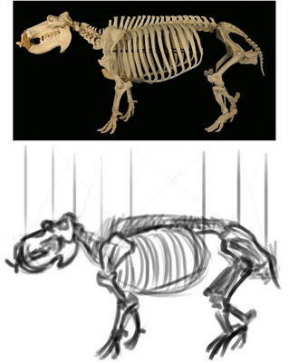
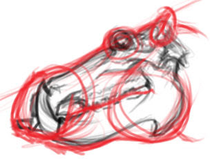
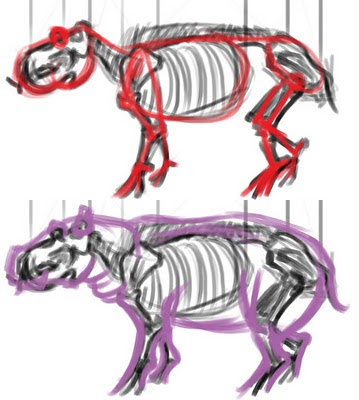
This gives me an understanding of how to arrange the hippo's anatomy, how it moves, and how its massive weight is held off the ground. It also gives me the opportunity to mentally catalog the unique visual characteristics of the hippo so I can draw it quicker and in such a way that it is easily identifiable in the image.

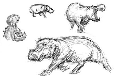
Then, I draw a few quick sketches from the visual reference I have collected, so my hand and eye get a feel for the kinds of curves and shapes that make up the creature. This also serves as a warm up for drawing the thumbnails. Warming up can be very helpful.


Step Two: Thumbnail Sketches

Next, I deal with composition. I work at the proportions of the finished piece, scaled down. I explore the various ways of displaying the hippo rider's form. At this stage, I don't have to put more than a few minutes into each thumb. Many artists put in less time, or do more thumbs, but I find twenty five gives me a lot of options, and allows each thumb to be clearer.


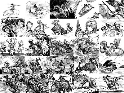
Try to think of each thumb as a visual experiment. Don't let any one thumb become too precious. Just put the idea down and move on. It can be easy to run out of ideas if you let yourself get too rigid. Only adhere to what is absolutely essential to the image, and let everything else change. In this case, so long as I show at least one hippo and someone sitting on it, it passes. Play with the angle that the subject is seen from, the situation the subject is in, etc.

In my next installment, I will talk about picking out the thumbs that work best, and moving into the rough sketch.

Friday, April 30, 2010

Fox in Socks

This week I handled a freelance job designing t-shirts. I worked with the phrase "crazy like a fox", and drew some fox stuff and illustrated type.

This piece is one of the rejects, taken to the next level. The way I handled the stylization of the figure made it unsuitable for the demographic the t-shirt company was going for. However, I thought it was a good character concept, at least. So, after finishing the job I put in a few hours to polish up the drawing, and here are the results:


P.S. A special prize goes to the first person who can spot all the vulpine references in the costume.

Wednesday, April 21, 2010

The Monstrous Manual Project 002

The next installment of this nostalgic project was a little harder to pick than the first. I decided that there was no way I could continue going in alphabetical order, or any organized order, for that matter. But that posed the problem of an over abundance of really inspiring options. In the end, I decided to pick creatures based on what would be good for my portfolio. So instead of painting nymphs, dryads, or other humanoid creatures, I chose:

Wyvern

Pronounced why-vern, this two legged cousin of the dragon is a terrible airborne predator. They swoop down on their prey, attempting to sink their talons into it and lift it up into the air, where they bite and use a deadly, poisonous stinger on the end of their tails. Around forty feet from nose to tail, propelled by a fifty foot wingspan, these things can fly carrying two man sized creatures at once, and could even prey on larger fare.


Friday, April 9, 2010

Self Portrait

Here's a piece I did recently for a self-portrait contest on deviantart.


Unfurling our dreams
To annoint our backs
Hoping paint won't melt like wax

Saturday, April 3, 2010

Into the Heart of the Machine


Here is the second piece for the contest going on over at Palladium, a role-playing-game publisher.

With this piece I decided to try out a lighting trick I had seen many times before and read about recently. The idea is to use a series of different colored lighting, creating zones of color, to enhance the sense of distance in the painting.

For this image, I wanted to generate a feeling of caution and unease. I tried to do that with color, composition, and narrative. I tried to choose colors that clash a bit, and as you get deeper into the city, where the characters are, the color and angle of the light becomes more and more artificial. I tilted the composition to give the viewer a sense of disorientation, a trick I stole from film noir cinematography. I tried to design the structures in the background so that their function isn't completely clear, making them more alien, then added the human element of graffiti on the foreground wall. The back two characters are stooped over and aware, but the foremost one is calm. My hope is that these disorienting contradictions establish a mood of simultaneous fear and exhilaration, anxiety and curiosity, that comes with embarking on an epic adventure, because the adventure is what RPGs are all about.

Sunday, March 28, 2010


Here is the finished piece from last week (duh). I decided to switch from cool blue colors to oranges and reds to convey the sense of urgency and violence.


Here is the second piece I'm making for the contest. I'm still deciding on a color palette, but I don't think the tones need much more work.


Also, after a lot of cleaning, tossing, rearranging, and more cleaning, I finally finished setting up a studio in my garage with Jessica.

Saturday, March 20, 2010

WIP from a Week Well Spent


All this past week I've been trying to dig in and put as many hours as I can towards this piece and one other for a contest being held by an RPG publisher. I've been trying to focus on mood and composition lately, reading as much as I can and looking at a lot of the illustrators from the golden age.

Sunday, March 14, 2010

The Monstrous Manual Project 001

I recently dug out my old Advanced Dungeons & Dragons 2nd Edition Monstrous Manual. Flipping through it reminded me of how much I used to sit with it in front of me, just looking at the illustrations. It's part of the reason I got into art. Anyway, it occurred to me that with all the great creature descriptions inside, I should try making my own illustrations. If nothing else, it'll be good practice and more stuff for the portfolio.

DISCLAIMER:

Dear Wizards of the Coast,

Please don't sue me.

Thanks,
~Z~


Aarakocra

The first creature in the Monstrous Manual, as it is alphabetized by the creature names, is the Aarakocra. Aarakocra are bird men that live in tribes in the mountains. They share large communal nests, and hunt with javelins using their thumbs on both hands and feet.


Friday, March 12, 2010

Friday, February 26, 2010

The Big One


"Three Wishes"
24"x36"
Acryllic on Canvas
$500

Here's another piece left over from my show at The Hive. While I was making it, I was thinking a lot about how dreams and aspirations keep us going through all kinds of discouraging, disheartening, and somewhat maddening events. Our wishes are huge and powerful things in our own worlds. They can be the light at the end of the tunnel, a nagging voice in the back of your head that makes you feel terrible for not doing more, or they can be a playground to frolic and dance around in.

Just look at how many opportunities we give ourselves to wish, all the rituals and ceremonies that go along with wanting something specific to happen. Every birthday we blow out the candles, when I go through tunnels I hold my breath, and there are countless forms of shooting stars, dandelion seeds, wishbones; all of them are a kind of magic spell we use to try to make something happen, or at least to remind ourselves of why we're working so hard.

A wish is a powerful thing, deeply personal and often secret. Most importantly, given how often we must succumb to the circumstances of our existence, wishes are one of the few opportunities in life we have to define ourselves, and choose who we are.

Wednesday, February 24, 2010

Happily Ever After

New work:


The Crane Who Caught the Moon
3"x5"
Acrylic on paper w/ cut paper

While working on this piece I was thinking a lot about happy fairytale endings. I was also looking at a lot of Yoshitaka Amano and Japanese woodblock prints. I really like framing the image with paper like this. It's something I'll definitely be doing again.